Metal logos |
Post Reply 
|
Page <12 |
| Author | ||
NecronCommander 
Forum Senior Member 

Joined: 26 Mar 2010 Location: Wisconsin Status: Offline Points: 79 |
 Post Options Post Options
") Thanks(0) Thanks(0)
 Quote Reply Quote Reply
 Posted: 17 May 2010 at 10:56pm Posted: 17 May 2010 at 10:56pm |
|
 |
||
 |
||
|
FusionKing
Forum Senior Member
Joined: 28 Mar 2010 Location: Scotland Status: Offline Points: 327 |
Post Options
Thanks(0)
Quote Reply
Posted: 16 May 2010 at 3:05pm |
|
|
^
I know.
|
||
|
||
|
lucas
Forum Senior Member

Joined: 31 Mar 2010 Location: France Status: Offline Points: 220 |
Post Options
Thanks(0)
Quote Reply
Posted: 16 May 2010 at 8:47am |
|
|
Jennifer, something is missing in your post

|
||
|
||
|
FusionKing
Forum Senior Member
Joined: 28 Mar 2010 Location: Scotland Status: Offline Points: 327 |
Post Options
Thanks(0)
Quote Reply
Posted: 11 May 2010 at 8:49am |
|
|
|
||
|
||
|
topofsm
MMA Metal Reviewer 
Joined: 30 Mar 2010 Location: Hate state, USA Status: Offline Points: 689 |
Post Options
Thanks(0)
Quote Reply
Posted: 07 May 2010 at 8:00pm |
|
|
Bands seem to get simpler as they evolve for some reason. Por ejemplo:
Early Enslaved: Modern Enslaved: 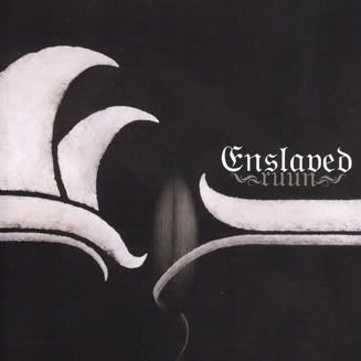 I wonder why that is. Also, some of these people seem to be putting up logos of their favorite bands, rather than really cool logos.  |
||
|
Lost respect for these archives when I saw Creed added, among other bands. Not going to be foruming here anymore. You can keep my reviews if you want.
|
||
|
||
|
Time Signature
MMA Special Collaborator 
Honorary Collaborator Joined: 04 Apr 2010 Location: Denmark Status: Offline Points: 7690 |
Post Options
Thanks(0)
Quote Reply
Posted: 06 May 2010 at 2:41am |
|
|
^^ Yeah :-) I actually like the more streamlined vanilla version from "Perseverance"better than the older versions. I'm glad they kept the scythe though.
|
||

|
||
|
||
|
Stooge
MMA Special Collaborator

Honorary Collaborator/Retired Admin Joined: 25 Mar 2010 Location: Whitby, ON, CAN Status: Offline Points: 5637 |
Post Options
Thanks(0)
Quote Reply
Posted: 05 May 2010 at 7:54pm |
|
|
I like how with Death, their logo became more simplified as their music became more complex.
|
||
|
||
|
harmonium.ro
Forum Senior Member

Joined: 28 Mar 2010 Location: Paris Status: Offline Points: 141 |
Post Options
Thanks(0)
Quote Reply
Posted: 05 May 2010 at 7:23pm |
|
It didn't actually change, at least not the writing in itself. To use a musical analogy, it's like the same composition but with different arrangements |
||
|
||
|
NecronCommander
Forum Senior Member
Joined: 26 Mar 2010 Location: Wisconsin Status: Offline Points: 79 |
Post Options
Thanks(0)
Quote Reply
Posted: 05 May 2010 at 4:23pm |
|
 The Devin Townsend one I think is particularly good. Edited by NecronCommander - 05 May 2010 at 4:25pm |
||
|
||
|
Time Signature
MMA Special Collaborator
Honorary Collaborator Joined: 04 Apr 2010 Location: Denmark Status: Offline Points: 7690 |
Post Options
Thanks(0)
Quote Reply
Posted: 05 May 2010 at 11:25am |
|
It's interesting how this logo changed throughout the history of the band:  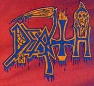  "Scream Bloody Gore", "Leprosy", and "Spiritual Healing": spider & web, blood, inverted cross, hellfire, grim reaper 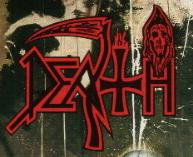 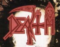 "Human" and "Individual Thought Patterns": the blood is gone, as is the spider; the cross is less inverted, and the scythe has lost its handle - and the "a" has been changed too.  "Symbolic": cross completely neutralized, the hellfire is gone, the blood has been removed from the scythe (whose handle is back), and the old "a" is back.  "Sound of Perseverance": the scythe handle's gone again, and the grim reaper has left the building. |
||
|
|
||
|
||
|
NJCat_11
Forum Senior Member

Joined: 25 Mar 2010 Location: Denver, CO Status: Offline Points: 244 |
Post Options
Thanks(0)
Quote Reply
Posted: 04 May 2010 at 11:13am |
|
   Edited by NJCat_11 - 04 May 2010 at 11:14am |
||
|
||
|
Stooge
MMA Special Collaborator
Honorary Collaborator/Retired Admin Joined: 25 Mar 2010 Location: Whitby, ON, CAN Status: Offline Points: 5637 |
Post Options
Thanks(0)
Quote Reply
Posted: 04 May 2010 at 10:34am |
|
|
I'm a fan of the old Carcass logo. The letters are kind of slanted, but I still think it looks cool.
|
||
|
||
|
Sleepwalker
MMA Special Collaborator
Honorary Collaborator/Retired Admin Joined: 25 Mar 2010 Location: The Netherlands Status: Offline Points: 292 |
Post Options
Thanks(0)
Quote Reply
Posted: 04 May 2010 at 9:39am |
|
|
|
||
|
||
|
Vehemency
MMA Special Collaborator

Honorary Collaborator Joined: 25 Mar 2010 Location: Finland Status: Offline Points: 972 |
Post Options
Thanks(0)
Quote Reply
Posted: 04 May 2010 at 8:16am |
|
|
Continuing with the easy-to-read theme:
Paracoccidioidomicosisproctitissarcomucosis (I must have been bored because I have learned to write that name without checking) Edited by Vehemency - 04 May 2010 at 8:16am |
||
|
||
|
Certif1ed
MMA Special Collaborator

Honorary Collaborator Joined: 29 Mar 2010 Location: London Status: Offline Points: 473 |
Post Options
Thanks(0)
Quote Reply
Posted: 04 May 2010 at 7:42am |
|
|
|
||
|
||
|
lucas
Forum Senior Member
Joined: 31 Mar 2010 Location: France Status: Offline Points: 220 |
Post Options
Thanks(0)
Quote Reply
Posted: 04 May 2010 at 6:56am |
|
|
Some of the most easily recognizable logos :
Edited by lucas - 04 May 2010 at 6:57am |
||
|
||
|
Time Signature
MMA Special Collaborator
Honorary Collaborator Joined: 04 Apr 2010 Location: Denmark Status: Offline Points: 7690 |
Post Options
Thanks(0)
Quote Reply
Posted: 04 May 2010 at 3:51am |
|
|
That's easy to read... it says Xasthur.
|
||
|
|
||
|
||
|
topofsm
MMA Metal Reviewer
Joined: 30 Mar 2010 Location: Hate state, USA Status: Offline Points: 689 |
Post Options
Thanks(0)
Quote Reply
Posted: 03 May 2010 at 11:58pm |
|
|
What are some sweet metal logos, in your opinion?
Wolves in the Throne room has a really awesome one IMO:  Here's a completely awesome, yet totally indecipherable one: 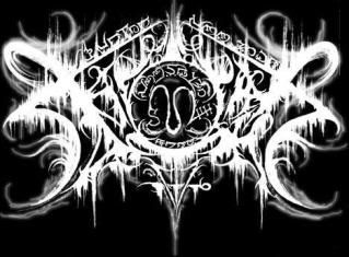 I won't disclose it until a couple people ask, just to keep things fun. Anyways discuss!  |
||
|
Lost respect for these archives when I saw Creed added, among other bands. Not going to be foruming here anymore. You can keep my reviews if you want.
|
||
|
||
|
Post Reply
|
Page <12 |
 Tweet
Tweet
|
| Forum Jump | Forum Permissions You can post new topics in this forum You cannot reply to topics in this forum You cannot delete your posts in this forum You cannot edit your posts in this forum You cannot create polls in this forum You cannot vote in polls in this forum |


 Topic Options
 Time Signature wrote: