Metal logos
Printed From: MetalMusicArchives.com
Category: Metal Music Lounges
Forum Name: Metal Music Lounge
Forum Description: General metal music discussions (no polls)
URL: http://www.MetalMusicArchives.com/forum/forum_posts.asp?TID=541
Printed Date: 09 May 2024 at 3:34am
Software Version: Web Wiz Forums 10.16 - http://www.webwizforums.com
Topic: Metal logos
Posted By: topofsm
Subject: Metal logos
Date Posted: 03 May 2010 at 11:58pm
|
What are some sweet metal logos, in your opinion? Wolves in the Throne room has a really awesome one IMO:  Here's a completely awesome, yet totally indecipherable one:  I won't disclose it until a couple people ask, just to keep things fun. Anyways discuss!  ------------- Lost respect for these archives when I saw Creed added, among other bands. Not going to be foruming here anymore. You can keep my reviews if you want. |
Replies:
Posted By: Time Signature
Date Posted: 04 May 2010 at 3:51am
|
That's easy to read... it says Xasthur.
------------- 
|
Posted By: lucas
Date Posted: 04 May 2010 at 6:56am
|
Some of the most easily recognizable logos :
|
Posted By: Certif1ed
Date Posted: 04 May 2010 at 7:42am
|
|
Posted By: Vehemency
Date Posted: 04 May 2010 at 8:16am
|
Continuing with the easy-to-read theme: Paracoccidioidomicosisproctitissarcomucosis (I must have been bored because I have learned to write that name without checking) |
Posted By: Sleepwalker
Date Posted: 04 May 2010 at 9:39am
|
http://fotopocket.nl"> http://fotopocket.nl">
|
Posted By: Stooge
Date Posted: 04 May 2010 at 10:34am
|
I'm a fan of the old Carcass logo. The letters are kind of slanted, but I still think it looks cool. |
Posted By: NJCat_11
Date Posted: 04 May 2010 at 11:13am
   ------------- http://www.chess.com/members/view/NJCat?ref_id=1432587 - Come and play me at Chess.com http://www.youtube.com/user/NJCat?feature=mhw4 - Homepage |
Posted By: Time Signature
Date Posted: 05 May 2010 at 11:25am
It's interesting how this logo changed throughout the history of the band:  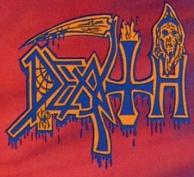  "Scream Bloody Gore", "Leprosy", and "Spiritual Healing": spider & web, blood, inverted cross, hellfire, grim reaper 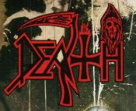 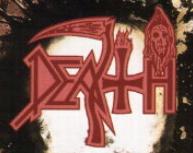 "Human" and "Individual Thought Patterns": the blood is gone, as is the spider; the cross is less inverted, and the scythe has lost its handle - and the "a" has been changed too.  "Symbolic": cross completely neutralized, the hellfire is gone, the blood has been removed from the scythe (whose handle is back), and the old "a" is back.  "Sound of Perseverance": the scythe handle's gone again, and the grim reaper has left the building. -------------
|
 lucas wrote:
Posted By: NecronCommander
Date Posted: 05 May 2010 at 4:23pm
 The Devin Townsend one I think is particularly good. |
Posted By: harmonium.ro
Date Posted: 05 May 2010 at 7:23pm
It didn't actually change, at least not the writing in itself. To use a musical analogy, it's like the same composition but with different arrangements  |
Posted By: Stooge
Date Posted: 05 May 2010 at 7:54pm
| I like how with Death, their logo became more simplified as their music became more complex. |
Posted By: Time Signature
Date Posted: 06 May 2010 at 2:41am
|
^^ Yeah :-) I actually like the more streamlined vanilla version from "Perseverance"better than the older versions. I'm glad they kept the scythe though. -------------
|
Posted By: topofsm
Date Posted: 07 May 2010 at 8:00pm
|
Bands seem to get simpler as they evolve for some reason. Por ejemplo: Early Enslaved: Modern Enslaved: 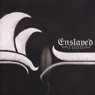 I wonder why that is. Also, some of these people seem to be putting up logos of their favorite bands, rather than really cool logos. ------------- Lost respect for these archives when I saw Creed added, among other bands. Not going to be foruming here anymore. You can keep my reviews if you want. |
Posted By: FusionKing
Date Posted: 11 May 2010 at 8:49am
|
http://www.google.co.uk/imgres?imgurl=http://www.seeklogo.com/images/A/Anthrax-logo-EFA283BBAA-seeklogo.com.gif&imgrefurl=http://www.seeklogo.com/tag.html%3Fq%3Dmusic%26Page%3D6%26Sort%3DDownload-Desc&usg=__01z94jPdkuWCwKFHYOlO9P2jYl4=&h=200&w=200&sz=3&hl=en&start=13&um=1&itbs=1&tbnid=J7xD2pRBGQXoIM:&tbnh=104&tbnw=104&prev=/images%3Fq%3Danthrax%2Blogo%26um%3D1%26hl%3Den%26tbs%3Disch:1">
|
Posted By: lucas
Date Posted: 16 May 2010 at 8:47am
Jennifer, something is missing in your post 
|
Posted By: FusionKing
Date Posted: 16 May 2010 at 3:05pm
|
^
I know.
|
Posted By: NecronCommander
Date Posted: 17 May 2010 at 10:56pm
 |
Posted By: J-Man
Date Posted: 23 May 2010 at 12:08pm
 Look closely at the A and the C... and keep in mind that the band's name is Anal Cunt.  ------------- Check out my YouTube channel! http://www.youtube.com/user/demiseoftime" rel="nofollow - http://www.youtube.com/user/demiseoftime |
Posted By: NecronCommander
Date Posted: 31 May 2010 at 9:24am
| That's just wrong. |
Posted By: Time Signature
Date Posted: 31 May 2010 at 12:59pm
 -------------
|
Posted By: UMUR
Date Posted: 31 May 2010 at 3:28pm
I have a t-shirt with that logo and underneath it says: "I Reek of Putrefaction" ------------- http://www.lyngby-boldklub.dk/" rel="nofollow - Forever TRUE - Forever BLUE! https://rateyourmusic.com/~UMUR" rel="nofollow - UMUR on RYM |
Posted By: Time Signature
Date Posted: 01 Jun 2010 at 6:08am
|
Heheheheh... nothing like a b bit of Carcass humor. I bought the "hermetically sealed" version of "Reek of Putrefaction" some time ago. -------------
|
Posted By: Pekka
Date Posted: 28 Aug 2010 at 2:48pm
Maybe it's just the fanboy in me speaking, but you can't really beat these. I like the design and the fact that I can actually read them. I used to do my signature the Metallica way back in my teens. This version of Iron Maiden is way better than the one they use nowadays, with the downward pointing edges cut out. The Opeth logo describes the music very well. ------------- http://iamthreepeople.bandcamp.com" rel="nofollow">  <- Click on this! <- Click on this!
|
Posted By: Time Signature
Date Posted: 28 Aug 2010 at 6:22pm
|
What about the "modified" Maiden logo?
-------------
|
Posted By: Pekka
Date Posted: 29 Aug 2010 at 2:26am
|
^Umm, which one? ------------- http://iamthreepeople.bandcamp.com" rel="nofollow"> <- Click on this!
|
Posted By: Stooge
Date Posted: 29 Aug 2010 at 11:14am
|
I didn't even realize that Maiden modified their logo . It really doesn't look that different to me. I guess having the long edges might not look right in some contexts (album covers, adverts, etc.), but it's not as drastic a change as some other bands. While we're on the subject, I like the look of Judas Priest's old logo, even though the style is not the most original. Their logo has had several changes.  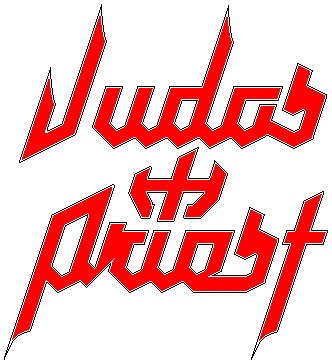 There are certainly a few others as well. Of the above versions, I like the look of the 2nd one the best. Not a fan of their more modern ones, and the first one with the cross for the T is isn't as easy on the eyes as the second one. |
Posted By: Vehemency
Date Posted: 21 Sep 2010 at 4:44pm
|
Some favourites of late. |
Posted By: Time Signature
Date Posted: 22 Sep 2010 at 4:59am
THe one they started using on Virtual XI (all the pointy ends have been removed):  -------------
|
Posted By: Catcher10
Date Posted: 26 Sep 2010 at 8:12pm
 ------------- US Festival '83 "Heavy Metal Sunday" Survivor.... |
Posted By: Andyman1125
Date Posted: 20 Jan 2011 at 4:02pm
I love this type of artwork, but my one problem is I can't read what the band's name is for the life of me ------------- http://bit.ly/kZR7BC" rel="nofollow">  http://andywebb.bandcamp.com/" rel="nofollow - My Bandcamp http://andywebb.bandcamp.com/" rel="nofollow - My Bandcamp
|
Posted By: Andyman1125
Date Posted: 20 Jan 2011 at 4:03pm
|
And I always thought this one was pretty cool ------------- http://bit.ly/kZR7BC" rel="nofollow"> http://andywebb.bandcamp.com/" rel="nofollow - My Bandcamp
|
Posted By: SKwid
Date Posted: 20 Jan 2011 at 6:22pm
|
bands name is: Paracoccidioidomicosisproctitissarcomucosis -------------  
|
Posted By: Andyman1125
Date Posted: 20 Jan 2011 at 7:17pm
|
^^Now that's just superfluous, ridiculous, pretentious, and a few other "ous," I bet. I mean seriously, who names a band that? ------------- http://bit.ly/kZR7BC" rel="nofollow"> http://andywebb.bandcamp.com/" rel="nofollow - My Bandcamp
|
Posted By: The Block
Date Posted: 20 Jan 2011 at 7:18pm
|
^ And you can tell that how?
-------------  |
Posted By: SKwid
Date Posted: 20 Jan 2011 at 8:27pm
i searched for the band, not the logo  -------------
|
Posted By: SKwid
Date Posted: 20 Jan 2011 at 8:27pm
someone who was dropped as a child -------------
|
Posted By: Andyman1125
Date Posted: 20 Jan 2011 at 10:05pm
I just can't fathom thinking of a name like that. "Hey, dude, what's your favorite band?" "Uh, just Paracoccidioidomicosisproctitissarcomuciosis." "...what?" "What, you've never heard of Paracoccidioidomicosisproctitissarcomuciosis?" ------------- http://bit.ly/kZR7BC" rel="nofollow"> http://andywebb.bandcamp.com/" rel="nofollow - My Bandcamp
|